
Your website is like a virtual business card.
But I’m going to let you in on a little secret. A website can be a whole lot more than a virtual business card.
It’s meant to be a salesman. Your salesman. So let me ask you a question. When was the last time your website actually brought you a sale? If you have to think about it, it’s been too long. Salesmen that don’t close deals on a regular basis tend to have a short career.
One of the biggest marketing mistakes a business can make is not understanding the purpose of their website, and when I say website, I really mean homepage. Your homepage, the first page people land on when they go to your web address, is where potential sales can made and lost.
Even if your business has absolutely nothing to do with the internet, like the automobile recycling industry, your homepage is still your first impression with each new visitor that sees it. Many people will decide within 8 seconds whether to stay or hit the back button and look for someone else to do business with.
With that in mind, let’s look at 5 warning signs that could be preventing your homepage from converting visitors into leads.
Warning Sign #1: Not Clean & Clutter Free
When you’re expecting people over for dinner, you get your house ready for guests. You remove any unnecessary objects lying around and do a little tidying up.
The same rule applies when people arrive at your homepage. You have less than 8 seconds to convince a website visitor (the average attention span of a human) to stay or they’ll move on to the next site. This is called bouncing (or bounce rate in Google Analytics).
Website pages with too much clutter and no clear purpose overwhelm people. According to Hubspot, a leader in internet marketing, visitors bounce from sites because they did not find what they were looking for, or because the website was too difficult to use. Cutting down on clutter will help with both of these issues.
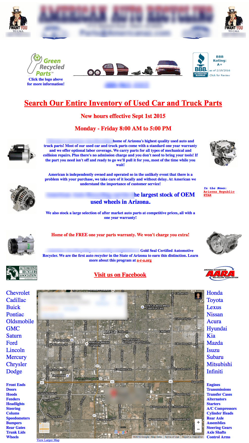
For example, this page could use a little decluttering:
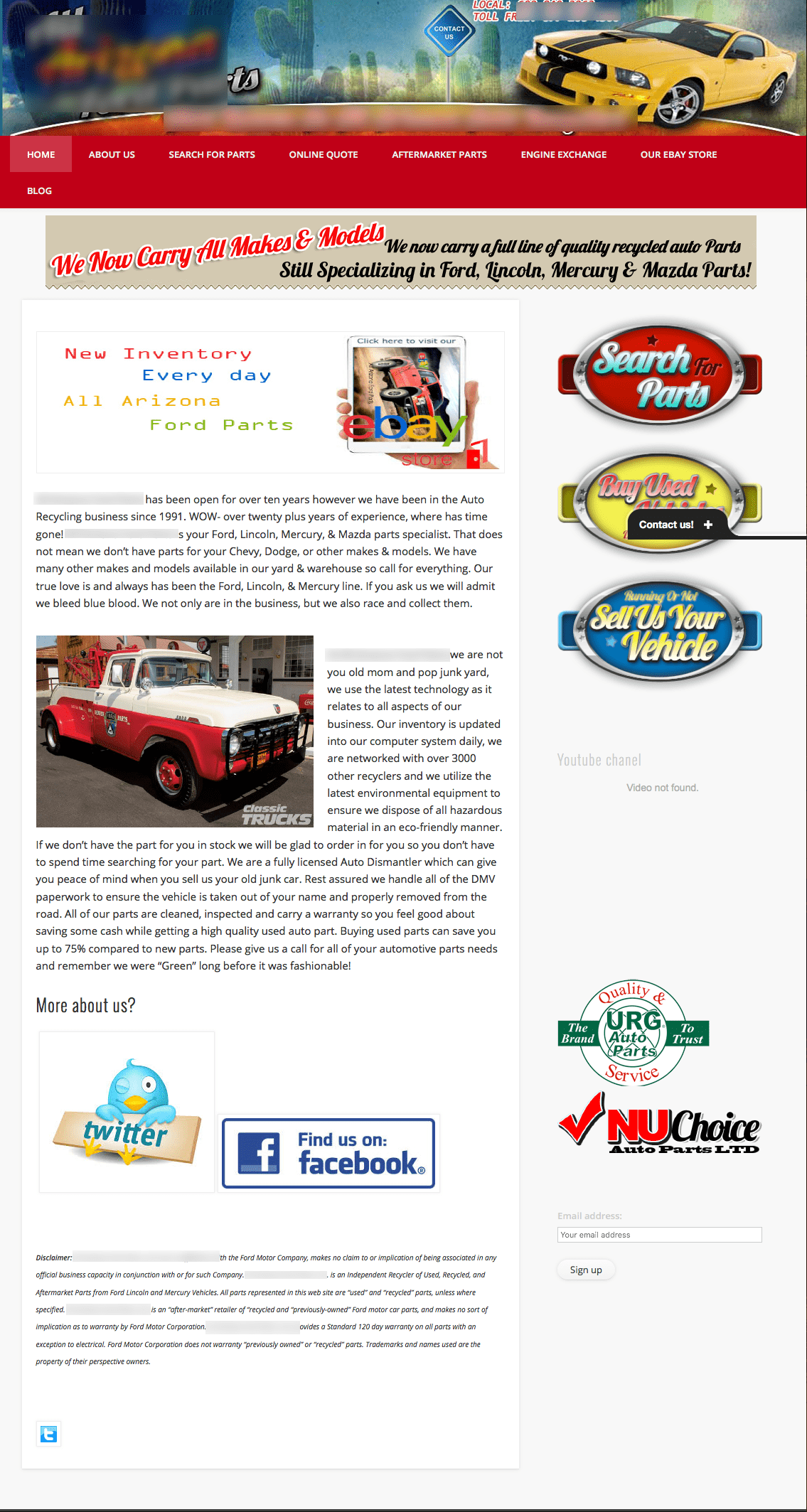
What should I do here? Are these buttons or images?
Do yourself a favor and resist the urge to fill every inch of space on the screen.
Less is more when it comes to homepage design. White space is your friend, and it helps to draw the eyes to more important elements on the page.
Warning Sign #2: No Intentional Design
Speaking of elements…
Are you wondering which elements to keep and which ones to remove? Consider this: decide the next step a customer should take after visiting your homepage. This is your call to action.
Ditch any elements that don’t provide the benefits of doing business with you and relieving your customer’s pain.
Examples of calls to action are contact us, signing up now, buy now or shop now. Anything that doesn’t encourage them to take this intended action is just white noise.
If there are too many options, people landing on the site won’t know what to do.
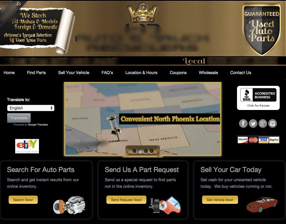
Distractions, no clear value proposition and strange fonts.
Warning Sign #3: Not Being as Expected
In addition to a call to action, basic business information is needed. Some pieces of a homepage are mandatory and for good reason. Visitors expect to see certain information about a business and they expect that information to be in a very specific place. All sites need an about us / learn more page, a contact us page, and ideally a blog – but I’ll cover that last one another day.
Human beings are creatures of habit. For example, most pages on the internet have all of these pages listed in the menu, and when people can’t find them, they’ll move on to the next site. Site visitors also expect to find these pages in the menu in a specific order. They want the contact page to be the last item in the menu.
It’s a simple move, so make it happen.
One more tip: make sure the contact info is in the footer of the homepage too. Don’t make customers work too hard.
Warning Sign #4: Text…Too Little and Too Much
It should go without saying that any text, also called copy, needs to be well thought out and without errors in grammar. If this isn’t your strong suit, hire it out. Trust me. Now, let’s talk about the best way to use copy to compliment the design of a homepage.
Remember the old fable of Goldilocks and the three bears? The first bowl of porridge was too hot. The second bowl of porridge too cold. The third was just right. Well, that is what good copy is all about.
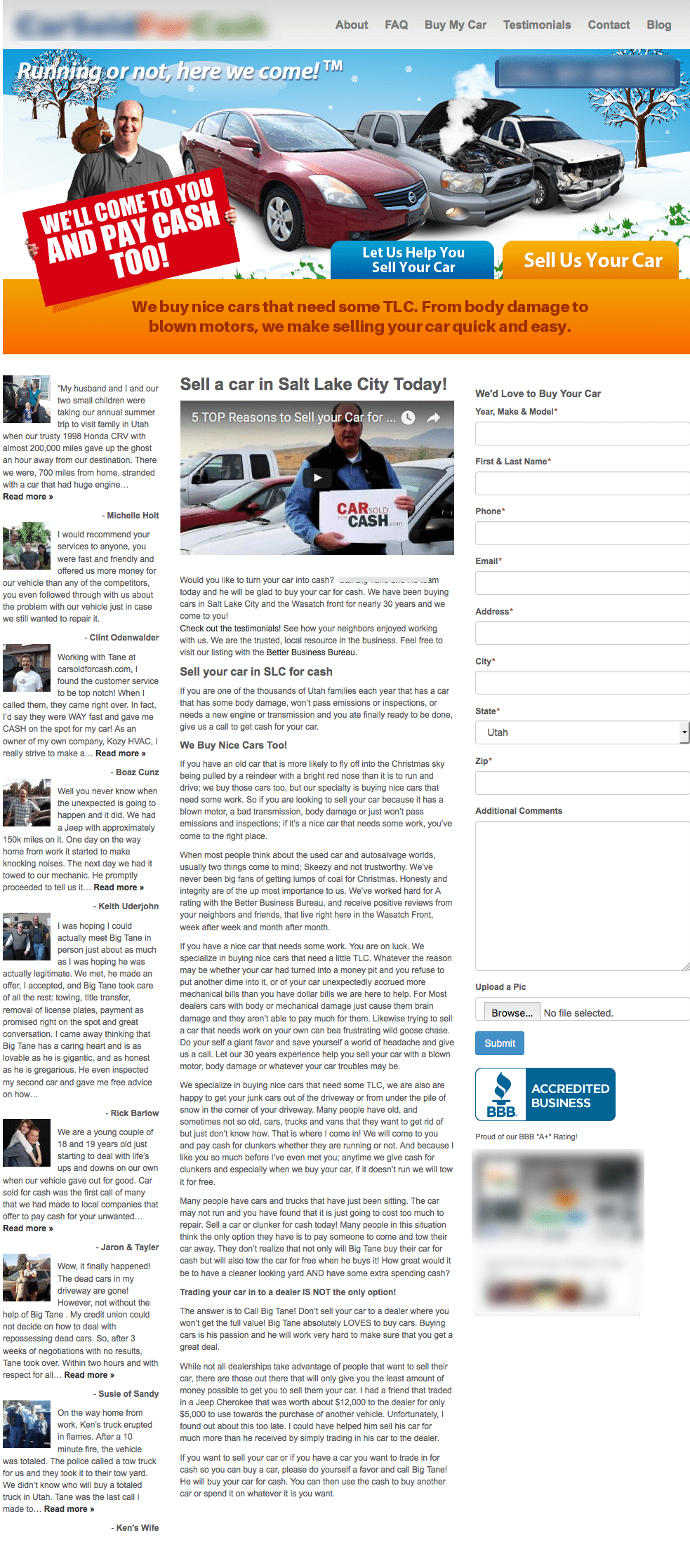
There’s a lot of text for website visitors to wade through!
Readers will not stay and read through a ton of text (remember the 8 seconds I mentioned above?).
Forbes listed this as the second most important consideration of good web design. Alternatively, too little text and visitors won’t be able to find the info they are looking for. There has to be that happy medium. Usually it’s between 500 and 1000 words, per page, but that’s just a guideline.
Make it a point to update the copy on the homepage often, and test out different versions. A/B testing, or testing two types of copy at the same time increased leads by 69% in one case study.
The text also needs broken up with subheads and pictures to make the page scannable and easy to read on a monitor. See how I’ve done that with this blog post? Yep, that’s what I’m talking about.
Warning Sign #5: Poor Photos and Artwork
The first rule here is that it needs to be professional. No smart phone photography and no artwork that looks like it came out of a 90’s video game.
Outdated graphics and poor pictures make a bad first impression
Professionally done visuals might cost a bit more up front, but remember considerations one and two: clean and intentional design. Pick only what is most important, and what guides visitors to the call of action.
When selecting photos or artwork make sure they pertain to the business unlike the photos below.
Sure, this girl below is eye candy, but they are really just a distraction from this sites purpose. It all goes back to the point of the site. If it’s an entertainment site great. If it’s a business site, it’s job is to get leads.
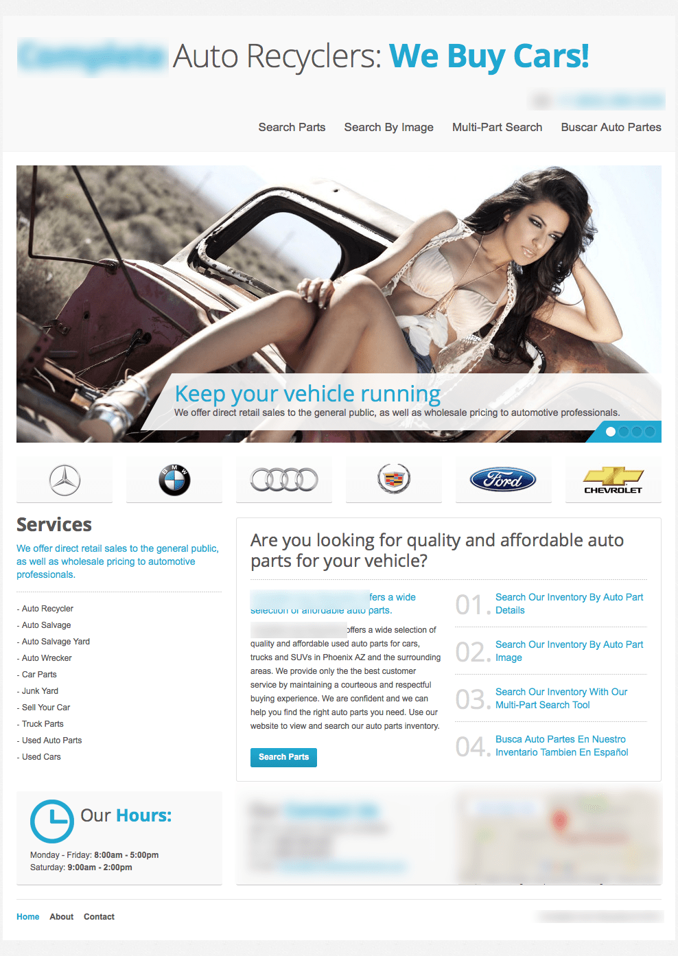
Is this a calendar shoot or an auto recycling business?
If you need additional resources on what makes for good photos and artwork, Wix.com has this great tutorial that goes a lot more in-depth.
And please, do all of us a favor and avoid cheesy stock photos of people who aren’t part of your team.
Tip: here’s a list of 17 sites that have free non stock photos. You’re welcome 🙂
In Conclusion
Keeping these 5 warning signs in mind will help you improve your homepage and make it head and shoulders above the competitors, especially in more offline industries like auto recycling.
Check out some of these concepts in action with this before and after shot of a recent Conversion Surge client.
Before, there was an image carousel of cartoonish vehicles, no clear value proposition and a missing call to action.
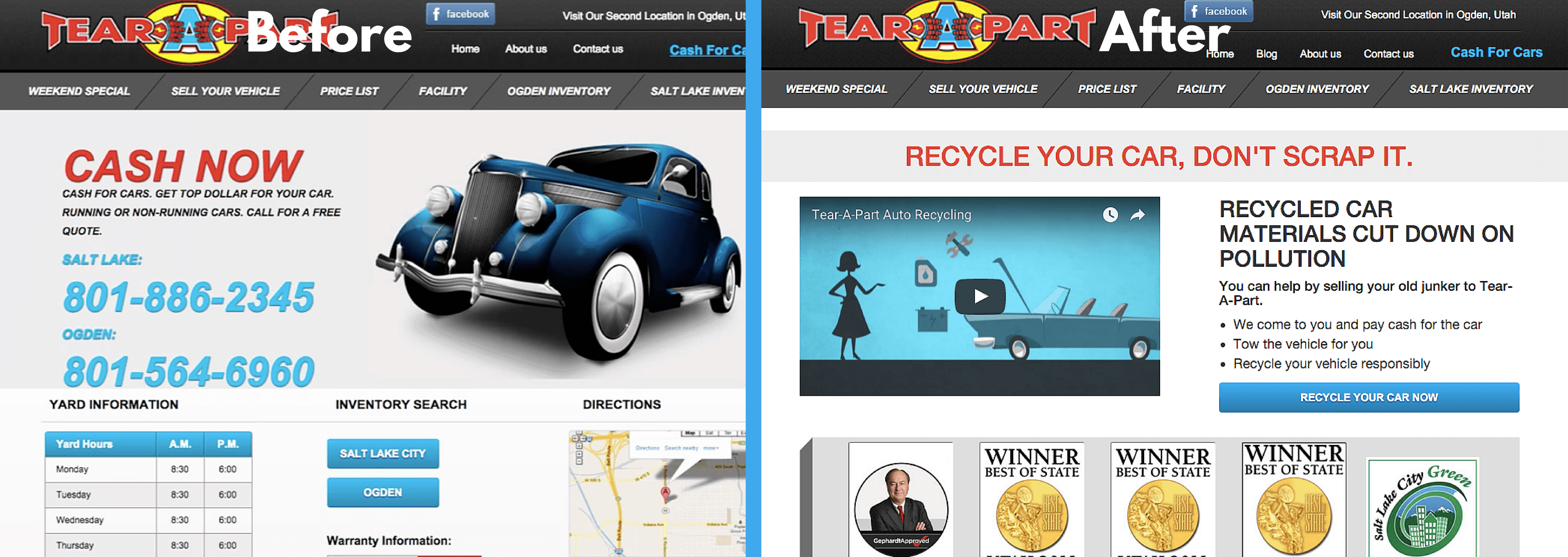
Now, there’s one headline, benefits of the headline and a single call to action button above the fold.
The results?
The conversion rate of the page on the left was never measured and there was no CTA. Now, we’re measuring conversions using Optimizely and Google Analytics.
The page on the right is converting ~3% of all homepage traffic into leads!
Think about that conversion rate…if you get an average of 10,000 visits per month, this is 300 leads coming into your business.
What would that do to your bottom line?