
You’ve probably heard by now that you need to “optimize” your website.
But what exactly does that mean and how does one go about doing it?
I looked up the meaning on the Merriam-Webster website and it defines “optimize” as making something good, or as effective, as possible.
So if someone tells you that you need to optimize your website then that means we need to make our website (that something) as effective as possible.
Side note: I mean really, come on, who wants an ineffective website?
In this article, I’m going to cover the 10 best ways that I know to “optimize” your website without the need for technical skills.
One reason you might want to consider optimizing your website is because as of today there are over 1 billion websites on the internet and 2.5 million blog posts published every day and if you want to give yourself a fighting chance to get noticed, well son, you’ve got to optimize.
Optimization Tip #1: Have a clear value proposition
First things first. If you created a website or blog, there must have been a reason behind – some sort of benefit, or value, to someone who visits it, right?
It’s the #1 reason why someone should stay on your website and/or do business with you.
Writing a value proposition can be, how should I say this, a royal pain in the butt.
To be honest, it’s not very fun. Not when all you want to do is change the design of your website or crank out that new blog post.
Look, it will take some time researching and doing a little bit of introspection but let me tell you something: without one, you’re dead.
And the less your business or blog is known, the stronger it needs to be.
Let’s walk through a few quick steps you can take to help develop your value proposition.
Step 1) Identify the category your blog or business falls into
Determine if what you offer belongs in one of these four categories
1) The best quality
2) The best bang for the buck
3) Your product or service defines luxury and aspiration or;
4) Your product or service is a must-have
Take a few moments to consider it.
Did you pick one? Great!
Now that you know what category your offering falls under, it’s time to differentiate it from everyone else who might offer a similar product or service like yours.
Step 2) Take a moment to consider what makes you different
Do you offer free shipping with every purchase?
The best customer service?
One-of-a-kind technology?
If you’re stumped, here’s a list of ideas to help you get started from CopyHackers:

Step 3) Refine your value proposition (offer) until you can articulate it in a single, instantly credible, sentence.
Struggling perhaps?
Think of this way: if you had just 10 words with which to describe why people should buy from you instead of someone else, what would you communicate to them?
Once you have it figured out, put it on your homepage.
Put it on your landing page.
Put it on your business cards.
Put that bad boy everywhere and be proud of it.
Not sure if it’s clear enough for people to understand?
That’s okay. Ring up your buddy, mother or father and just say “hey if I told you [INSERT VALUE PROP]. Would you understand what that meant?”
The second option is to head over to five second test, create a test with a link to your homepage and ask people the question “What do you think this page is about?”
And a word cloud will be automatically created with the most popular words from the respondents.
Here’s how the homepage of this website did (not too shabby).

Action step: Take the next 30 minutes developing iterations of your value proposition. Then run a free five-second test to see if it’s super clear for strangers to understand.
Optimization Tip #2: Have a nice homepage
No seriously, do.
Your homepage is the first impression you make to people who visit your site for the first time.
Consider this when working on your homepage: you wouldn’t want first time houseguests to come to your house and have it be so messy that people can’t find the restroom would you?
Exactly.
So remove all the unnecessary text, images and anything else that distracts the visitor from understanding what your website is all about.
In this case, less is better. It helps you get your point across quickly.
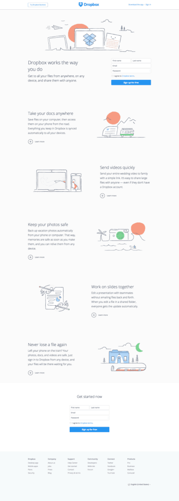
Have a look at the websites below as references.
Dropbox uses images and a little bit of text.
Nice clean, easy on the easy and you understand quickly what the website is about.
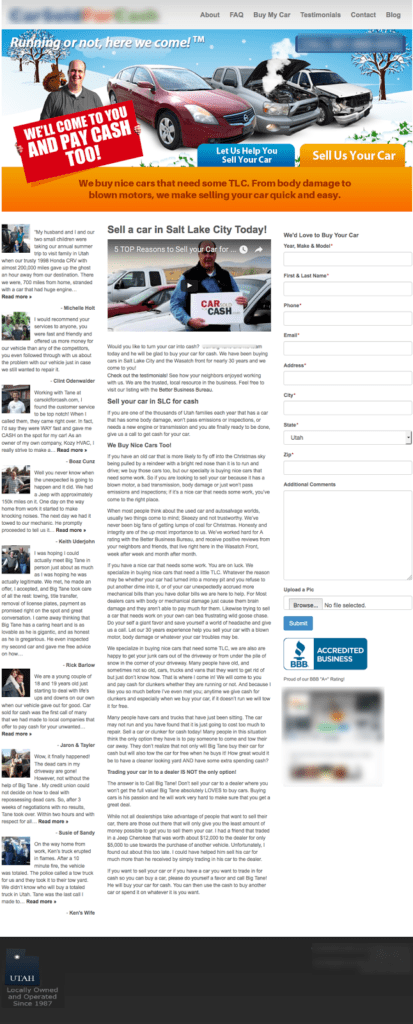
 Contrast that with the website below.
There are images of a car in the header then below that are paragraphs of text in font size 12.
Would you take the time to read all of that just to try and figure out if you’re in the right spot? Me either.
These days people are in a hurry – tell them clearly what you’re about and why they should be there.
Action Step: remove all of the unnecessary clutter on your homepage. Increase the font size so it’s legible at 2ft from the computer screen. Then, add a big, bright call to action button.
Optimization Tip #3: Have a call to action
When people visit your site, are you asking them to take any sort of action or are you just happy you have someone visiting?
One of the most overlooked areas for improvement I see when working on website are missing calls to action.
What exactly do I mean by a “call to action”?
It’s asking someone to take a specific action while on your website.
Actions such as:
“Download The Cheatsheet”
“Start 14 Your Day Trial”
“Register Now”
“Get Lesson 1”
Those are a few examples you can use as hyperlinks or button copy.
And a few more:

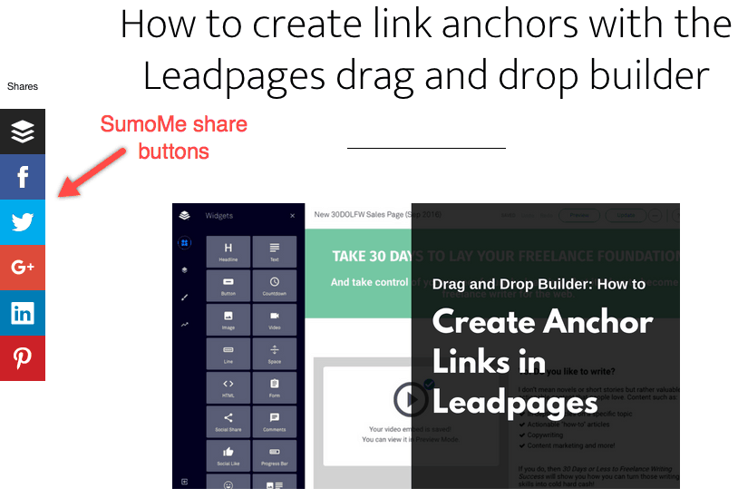
Image source: Leadpages
Action step: on every page of your website, go add a call to action. Even on your “About” page. Tell people to contact, try your product or service or download your case study. Whatever action you want them to take on that specific page, add it.
Optimization Tip #4: Have contrasting button colors
Here’s where a lot of folks get hung up: choosing button colors.
But let me tell you something: you’re not going to beat your competition because you changed the button color from green to orange.
Sorry.
Nonetheless, when it comes to button colors, all you need to do is this:
1) Make it look like a button
2) Make it contrasting in color so it stands out on the webpage
3) Step back six feet from the computer screen to make sure you can see the button
Simple right? But so many websites get it wrong.
Which is good for you, because now yours is better than the majority of the websites out there.
And as mentioned above in tip #3, try to avoid using non value words like “Submit, “Download” or “Register” as the call to action button copy.
Action step: go create those buttons!
Optimization Tip #5: Compress images and attachments
You know you already know this: slow websites suck 🙁
No one has time to wait around for your page to load – they’ll bounce and find a better website.
One of the best things you can do to make sure your website is running fast is by compressing your images and PDF’s.
It’s another overlooked area for improving a website. Many people create content and add images or other assets to their site and call it good without taking the time to make the files smaller.
Taking an extra 5-10 minutes to compress the media assets can reduce file sizes by up to 90% and save you seconds on page load times – especially when it’s an epic blog post 🙂
Action Step: depending on the file type, go to compressjpeg.com, compresspng.com or pdfcompressor.com. Drag and drop your files, then download them and upload to your website.
Optimization Tip #6: Add social share icons
You want more traffic, right?
Then why not make it super easy for people to share your content with the SumoMe <aff link> plugin?
With this plugin, you can drag and drop the services you want displayed, hide the share count until it reaches a certain number and select where you want it placed.
SumoMe recently changed the pricing from free to paid with their email list building tools but the share app is still free to use.
And fret not, it works with both WordPress and non-WordPress sites.
Action Step: go to SumoMe.com to download or install the plugin by searching for it when you add a new plugin from the backend of your WordPress site.
Optimization Tip #7: Use dedicated landing pages
Seriously, folks this is a BIG one.
If you run any sort of campaign, whether social media posts or paid ads on Google or Facebook, please, please, PLEASE don’t send them to your homepage.
This is another biggie that so many businesses get wrong.
Why can’t you send campaign traffic to your homepage?
Let me explain.
Your ads have a goal, right?
To sign up for your upcoming webinar.
To download your newest case study.
To sign up for a free course.
Whatever it is, you have an objective, or goal, for this campaign.
A singular goal that should align perfectly with the page you send them to.
If you choose to send people to a homepage, where might they click? What single call to action is there?
What other links are on your homepage?
For example, if you have 35 links on the homepage your odds of having that person complete your goal is 1:35.
A one in 35 chance they’ll get it right.
Not very good odds is it?
Oli Gardner, co-founder of Unbounce, used the following example in one of his presentations.
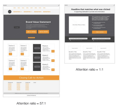
In this example, if the homepage (image on the left) has 57 buttons or links, a visitor from your campaign would have no idea where to click.
Maybe they find it eventually but odd are they won’t.
And they’ll bounce.
However, if the ad copy and landing page are aligned to your campaign goal then you’ll get a 1:1 attention ratio and higher likelihood that the visitor will convert.
This will also increase the click through rate (CTR) and relevancy score.
And guess what this does?
Brings your ad costs down and increases your ROI. Booyah!
How do you create a landing page?
Personally, I use LeadPages <aff link> for all of my landing pages.
Not only do they have beautifully designed templates that convert like crazy but they also have LeadBoxes and LeadDigits (my favorite when giving presentations or hosting webinars).
They recently launched their drag and drop builder and have (as of this writing) 70 templates you can start with for drag and drop.
My second favorite landing page builder is Unbounce. They’ve got a ton of templates and their builder is completely drag and drop.
Optimization Tip #8: Use clear, concise writing
Hey, sorry to burst your bubble here, but nobody wants to read 10 paragraphs about what you do (and really, nobody cares about you, nor me, anyway) so hurry up and get to the point by writing clear and concise copy.
Admittedly, I still struggle with this too, but I think I’m getting better.
As I’m sure you can relate, It’s just hard not to tell everyone how awesome we are 😉
But when you’re writing for the web it’s best to quickly get to the point and use easy to understand words.
Aim for writing at a 8th grade reading level if reaching a broad audience and a 12th grade reading level for B2B articles.
This isn’t due to lack of education, it’s so people can quickly read and interpret the words on your site.
I’ll leave you with my all time favorite lesson on how to write clear and concise copy by Ian Lurie.
“Brevity is the soul of wit (Lord Polonius in Shakespeare’s Hamlet)
Online, concise copy will always get better results than verbose copy.
How can I make that sentence shorter and give it more oomph?
1) Dump the passive voice.
Online, concise copy will always get better results than verbose copy.
2) Get rid of meaningless words.
Concise copy is always better, right? Plus folks are reading this online.
Online, Concise copy will always get better results than verbose copy.
3) Get rid of repeated words.
In copy, concise copy gets better results than verbose copy.
4) Replace four words with one.
In copy, concise gets better results than beats verbose.
5) Make sure it reads OK. In this case, I’m not thrilled with my phrasing. A little rejiggering does the trick:
Concise copy beats verbose.
The result is better.
This:
Online, concise copy will always get better results than verbose copy.
Became this:
Concise copy beats verbose.”
Indeed it does!
Action Step: review the copy on your website and shorten up.
Optimization Tip #9: Write like you speak
You have about 8 seconds to get your point across when someone visits your website for the first time.
That’s our average attention span as of 2015.
Therefore, it’s critical you use words that are easy to understand.
Here’s an example of what not to do:
“Revenue-focused marketing automation & sales effectiveness solutions unleash collaboration throughout the revenue cycle”
Huh?
Do you use words like that when you’re hanging out with your friends or chatting with your mother?
Then why would you write like that for the web?
One quick and easy way to write like you speak is to record yourself.
Action Step: get out the voice recorder on your phone. Pretend your buddy just asked you what your product does or what kind of service you provide. Then listen to it and remove the fluff and you’ll be left with something that is easily understood.
Optimization Tip #10: Collect emails
![]()
Unilaterally, the one thing my clients wish they would have done sooner is build an email list and develop a relationship with your audience.
Why?
First, think traffic for a second.
Despite the social media platforms that we can use to amplify our reach, we don’t have control over the changes they make when it comes to how they show our posts (right, Facebook?).
Nor can we predict if it’s going away anytime soon (hey, Google+) or be bought out by a billion dollar company with no experience on how to run a social media platform (howdy, Twitter).
But the one thing we can control and nurture are the folks on our email list.
Even if all the social media platforms go away or if the economy tanks again, we’ll have an (hopefully) engaged audience that loves hearing from us and will buy our products when we launch our next product.
So how do you start building a list?
Action Step: here’s how I would do it if I was starting out today:
Step 1: ask your friends, family and network if they would like to join your list. Let them know the topic and the type of people you plan to help. Use emails, texts, DM’s and chats. Don’t stop until you hit 100.
This should take 7-14 days.
And now you have 100 subs!
Step 2: Install email capturing software on your website. If you don’t mind paying, use SumoMe. Otherwise use Rapidology from Leadpages – it’s free!
Step 3: Create an opt-in box in your sidebar with cornerstone content like a free email course or ultimate guide/cheatsheet.
Step 4: Create an inline opt-in box on your most popular blog posts and offer a content upgrade (a piece of content that compliments the post thus, upgrading your content).
Not sure what kind of content upgrades you can create? Here are some ideas to help you get going:
- Downloadable PDF of the blog post (or your most popular post)
- Checklist to match your blog post
- Audio file of you reading your blog post
- Swipe file of your best work
- Case studies with tips on how they can do it
- Listicle
- A piece of your product (like a chapter of your e-book)
- Infographics
- Slide decks
- Your own personal routine (or a routine of a famous person)
Conclusion
Hopefully you find these tips to be helpful no matter where you’re at with your website.
And the next time someone asks if you’re optimizing your website, you’ll be able answer confidently with a list of things you’re doing to optimize it, or, by definition, making it as effective as possible.
If you have some tips to add of your own, please put them in the comments and I’ll look at having them added to this list.
By no means is this an exhaustive, end-all, be-all, list of things you can do to make your website better.
It’s simply a great starting point for those looking to optimize without hiring technical help.